 Volkswagen means "people's car" in German, in which it is pronounced [ˈfɔlksˌvaːgən]. Its current tagline or slogan is Das Auto (in English The Car). Its previous German tagline was Aus Liebe zum Automobil, which translates to: Out of Love for the Car, or, For Love of the Automobile, as translated by VW in other languages.
Ofcourse that kinda words taken from Wikipedia, lmao! End of the chit-fuckin'-chat! We're gonna go to the lesson as well. It's about TIME!
| First off, open 500x500px new blank document. I always like whenever I make a huge document image... just like this.. Lol. Forget about the RAM, Harddrive space, anything... Just enjoy your work here :)
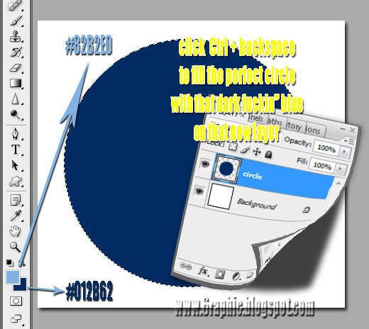
Now.. Change the Foreground Color to #82B2E0 and the Background Color to #012B62. Those are the primary colors of our logo. We will draw the basic circular shape of the logo now, so grab the Elliptical Marquee Tool (M) from the Tool Panel, and then while holding down the Shift key, draw a selection of a circle on your canvas, Or if you wanna make it the same as shown below, mine is about 350x350px constrain circle. Press Ctrl+Backspace to fill the selection with your pre-set Background Color. | |||||||||||||||||||||||||||
|
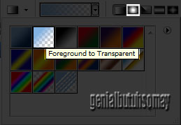
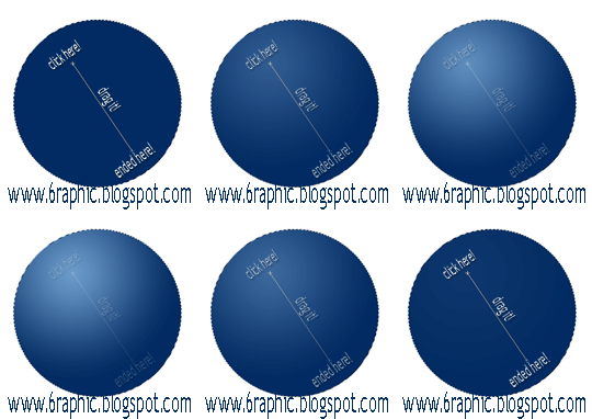
Again press G key on your damn PC then switch to Gradient Tool, make sure you choose Foreground to Transparent and Radial Gradient Type. | |||||||||||||||||||||||||||
|
| |||||||||||||||||||||||||||
|
| |||||||||||||||||||||||||||
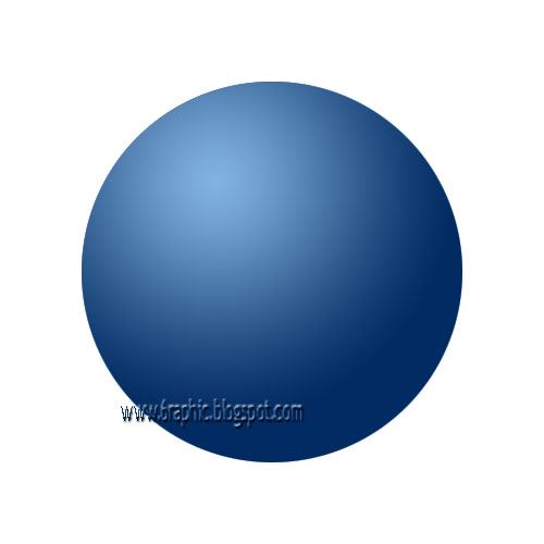
| Our logo is basically done, we will draw the actual emblem in the next stage of the tut.
| |||||||||||||||||||||||||||
| Applying the VW thing, lol..
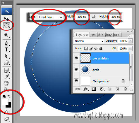
Should I tell you this once more again? OK it's alright.. Press D key to reset your Foreground and Background colors to their default white and black values and then press X key from your ugly keyboard to invert the colors' position. Start off by creating a new layer by simply press Shift + Ctrl + N, then name it whatever you like, mine's VW Emblem. Using the Elliptical Marquee Tool (M), draw a round selection inside the orb as shown below... | |||||||||||||||||||||||||||
| Actualy I fixed the size into 300x300px to get like the image above.
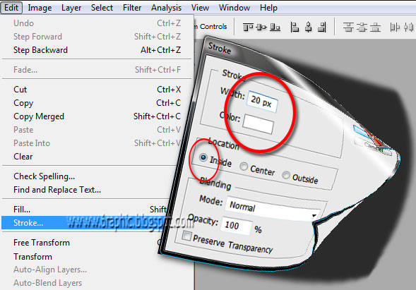
Go through Edit > Stroke and apply a 10 px wide inside stroke. | |||||||||||||||||||||||||||
| Once you press OK, you should get a result similar to this.
| |||||||||||||||||||||||||||
| Ignore about getting the unperfect white shit circle right about now, just ignore it!
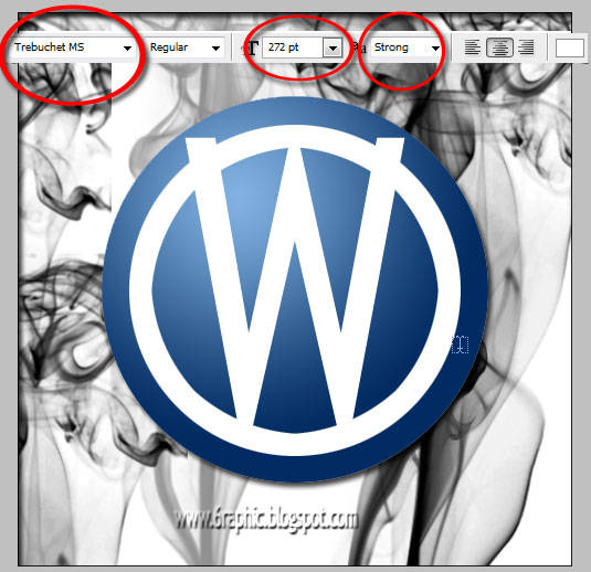
Here's the silly part but it is absolutely my favo... using the Type Tool (T) to get the V and W letter that represent the base structure of the VW logo, which obviously is a V with a W under it. | |||||||||||||||||||||||||||
|
| |||||||||||||||||||||||||||
| Done???
Lol.. this is my image should be :) | |||||||||||||||||||||||||||
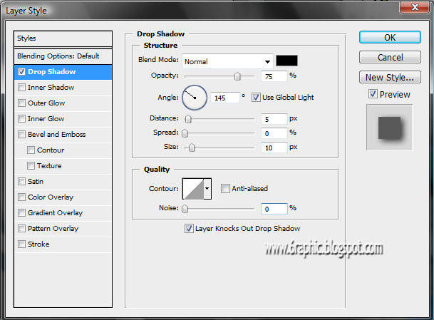
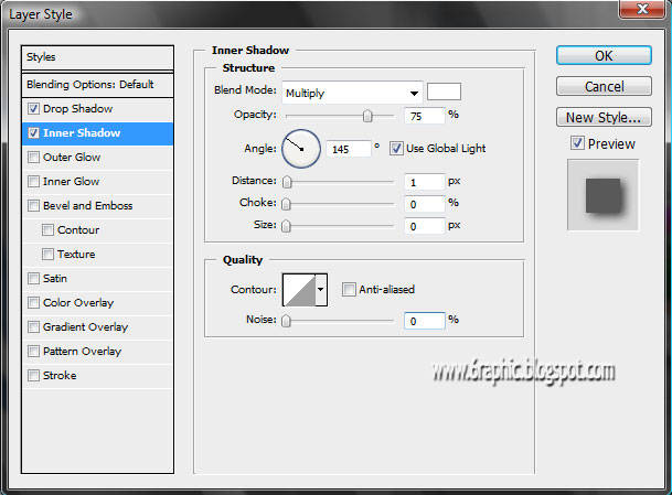
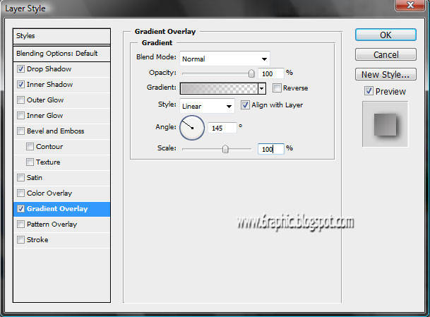
| OK, We are done with the drawing part, it's now time to give the emblem some style and a 3D-like effect. Access your Layers Panel, then right click on the layer that contains the emblem and choose Blending Options. Apply the following options for the Drop Shadow, Inner Shadow, Gradient Overlay.
| |||||||||||||||||||||||||||
|
| |||||||||||||||||||||||||||
|
| |||||||||||||||||||||||||||
| Once you apply all these effects you should get something similar to the image below.
| |||||||||||||||||||||||||||
| Your Volkswagen logo is finally complete, you can optionally add some gloss with Overlay or Soft Light layer styles to make it blend in with the logo more the same way it looks below.
| |||||||||||||||||||||||||||
| I advise you to experiment with this logo by applying your own touch of style to it, and make sure you show off your work in the 6raphic forum. I hope that you've learnt something new from my lil' freaky tut, feel free to email me if you have any comments or questions or alternatively post in the Forum to get instant feedback.
- End of Tutorial.
|






This comment has been removed by the author.
ReplyDeleteAPANYE YANG SEREM...
ReplyDeleteHEHHEHE
WAH JANGAN2 YANG AKU MAKSUD...
SAPA YA...
HAHAHHA
MENGADA2 AJA....
WAJAH WEBNYA BERUBAH...
SEMPET BINGUNG SC...
CARI KOLOM KOMENX NDEK MANA
PI BARANG AKU PELOTOTIN ...EH YA..TERNYATA...MATAKU DC...YG MESTI PRIKSA KE DOKTER..
HEHHEEH
MUNGKN TERLALU RAME..ATAU TERLALU BAGUS AJA YANG BIKIN...
mba' nya... gag ada yg berubah kuk dari page ini :(
ReplyDeletebikin pala gw dong skali-skali
ReplyDeletewewwww maen borong gini supaya jd yg pertama pa ya?!?!?! :p weeeee...
ReplyDeletetungguin gw lu... awas ngilang aje :(
Masih saya bungkus dulu, belum bisa praktek nih sob. Makasih tutorialnya nih, saya bookmark ya.
ReplyDeletegpp kawand lama :)
ReplyDeletekehadiranmu lebih berarti dari apapun :) terimakasih :)
ampyunnnnn dech..., mbukak blog ini berat banget..., gambarnya gede2 sieh...
ReplyDeletemirip award elegan yg pernah aku dapat deh tuh logo.
ReplyDeleteaku juga suka siomay. tapi gak maniak banget sih
nice content...salam hangat..
ReplyDeleteblog nya berbobot bgt (baca beraaat lodingnya wkekeek) maklum diriku fakir benwit
ReplyDeletendak bisa sotosop sayah.. hemmm hny bisa mengagumi karya karyanya
mantep....mantep....nice article, bisa jadi bahan latihan, terima kasih
ReplyDeletekq komentarnya pada ngerumpi disini..wkwkwkw
ReplyDeletemantab tutornya...seandainya saya jago sotosop...pasti lbh asyik bs berkreasi
Hello from Russia!!!
ReplyDeleteI look your web... I think, your VW logo is good!!!
I have my new art blog, and I have on this blog a logo of WordPress http://picart.info/pictures/wp_logo_uno/ I think, - this logo was made such technology...
Nice blog, noce post, salam kenal
ReplyDeletewah jadi tertantang tuk nyoba nih..
ReplyDeletetutorialnya lengkap banget
s' foto nya juga
untuk bandwidht lagi full jadi lancar Boss..
lain kali bikin design tuk Manowar ya... \m/
mksd na Manowar??? Manowar yg ini?!?!?!
ReplyDeleteKenapa masih bingung kawan, hehe
ReplyDeleteWah jago neh buat logo di photoshop, ajarin dung....
ReplyDeletewah, serius bang, berat banget loading blog ini....jd lupa sm tujuan semula datang ke sini..hehee...
ReplyDeletesekarang masih berat gag kang?
ReplyDeleteAsyik belajar ah :D
ReplyDeletesilahkan kang :)
ReplyDeletemantap...keren.
ReplyDeleteayo donk, tutorial yang lain lagi XDDD
huadduhhhh... situ tuu yg kmn ajja... lhohh.. gag nyambung... ada ko' mba' yg baru2.. :p stunya ajja yg gaya... gag mo maen lg di maree... :p
ReplyDelete