Thursday, April 23, 2009

Now... it's your time!

mau nyewa?


Have you ever thought you'd actually found someone you like alot then find out you were wrong?


No no no... that ain't the Question of the day..!!! Do not get mad of me, lmao... it's a trapp or something??? I got your attention, didn't I? I'm gonna ask you this...

Which one d'ya prefer?

This is difficult without one of them, there are side projects with the MS Pratama namebrand on the cover, nothing more. I can't vote on this one as I like all of versions of the image equally. I find myself listening to SEPULTURA slightly more, but not enough to get a vote.


I wasn't asking your fave!! Just which of the masterminds for each time you prefer, for Heaven's sake! I know it depends on what it is and who made the trick. Some are just awful quality, some are just cheaper of the same. I just want good quality for my lovely blog.


Ask questions and share your knowledge with the world here on Freaky Blog. Get the best answers where there are no duplicate questions and questions are always open.


I cannot guarantee the accuracy of answers submitted by members, and we recommend that you use common sense when following any advice found here.

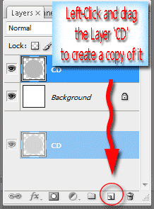
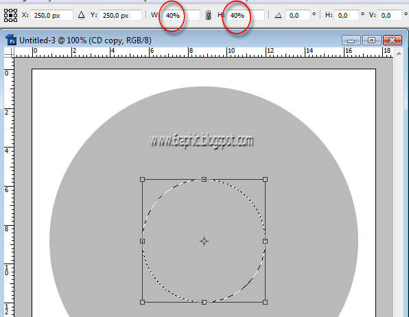
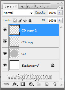
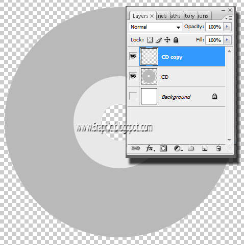
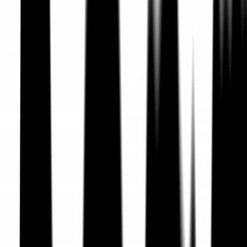
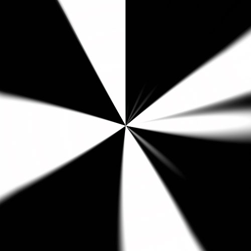
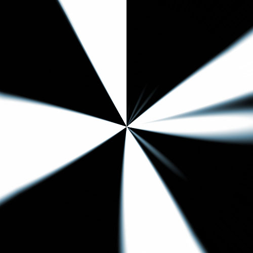
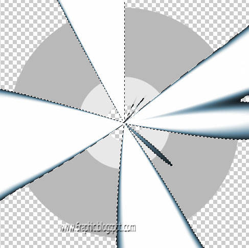
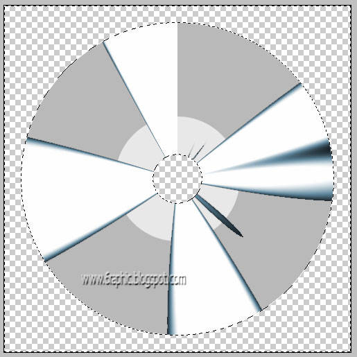
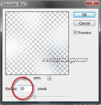
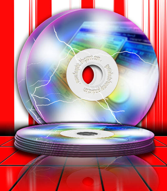
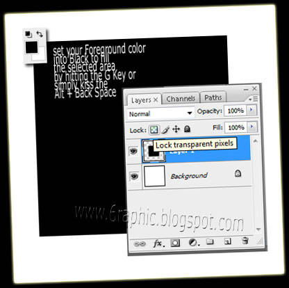
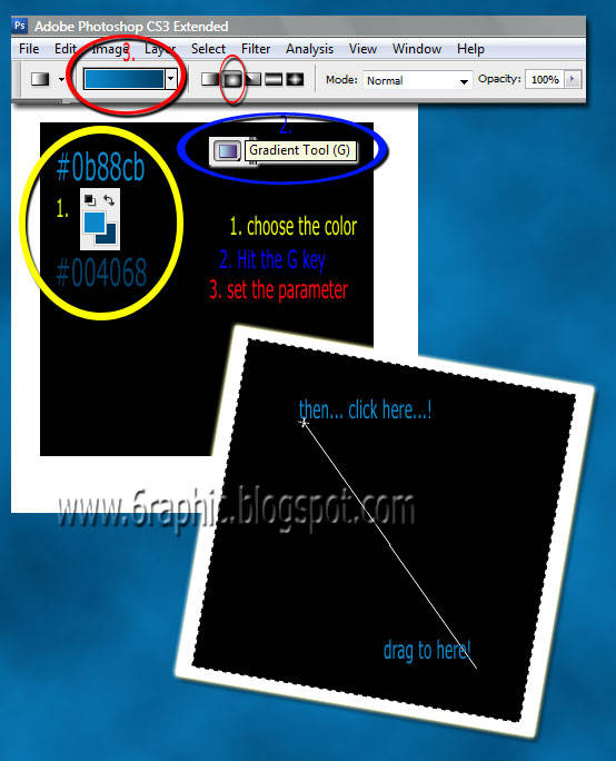
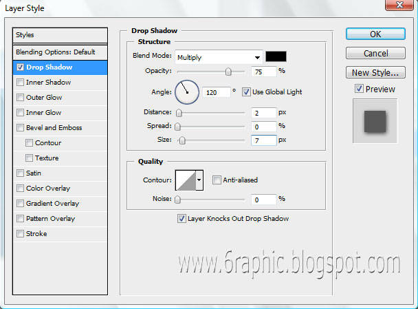
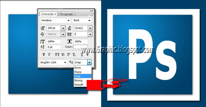
In other words, for the next .psd Lesson, from that images above...
which one d'ya prefer?


Send me new answers to this question!


Somewhere out of a memory of lighted streets on quiet nights...


Wednesday, April 22, 2009

The 3rd Award

Award is -always- given to the manager of a blog (blogger) that with all their resources have been pouring their creativity, their brilliant ideas, their activity in writing in the blog or even just bloghop thing.

The text of course that should be able to provide ideas or direct action on the readers to do the positive and useful, for itself or its surrounding communities all over the world (...of blogging).

This very cute Trophy Award was given to me by Zhatira el Qisya, sorry for this late brother...


I would like to thank -ofcourse- to him or her, whatever... for giving me this very nice awards and for always visiting my site. And... I would like to share this one to all my blogosphere friends... in particularly to Ila Schaffer, Chikal Botaxxx, Bunga Raya, Yulia & Chacha.

For others.. feel free to grab this very nice awards. It's FREEEE OF CHARGE!!!


Monday, April 20, 2009

Viva la Piracy! (Secondo)

This badge (blogger friendship below) was given to me by Muzda. She is one of my nice and sweet friend here in blogosphere. Thank you so much for the friendship Dada.

Here's the Award...


Actualy, this is my third award, but this time I knew the rules :) and I don't wanna make another mistake just like I did before... I'm so sorry for the last time :( ofcourse, including you Quinie, and Attayaya. My mistake!


This is it!

muzda ma men


You know the rules gang!

# Take your award here
# Put the logo obviousely on your corner
# Add a link to the person who awarded you
# Nominate at least 7 other blogs
# Add links to those blogs on yours
# Leave a messages for your nominees on their blog


This badge represents friendship and now I will pass this badge to: Quinie, Attayaya, Suryaden, E-Je, J O N K, Gdenarayana, Veva, Wh, Meryl, Sang cerpenis bercerita, ♥ Neng Aia ♥, wi3nd, Natalia, Romo, (whoever consider me as friend ^_^ hehe).


"Bagi yang gag kesebut muhun maaf sebesar-besarnya.. karena sumpah saya masih belum biasa menangani ini.. muhun di maafkeun setulus ikhlasnya."


Thank you so much Muzda for giving me these wonderful awards.
I really appreciate it so much.

Friday, April 17, 2009

Cara menggabung domain blogspot.com ke co.cc

Gratis. Menarik bukan mendengar kata satu itu. Apalagi yang sekarang kita bicarakan adalah sebuah domain, lebih tepatnya subdomain. Untuk para pemula, yang kebetulan belum mempunyai blog, bisa meluangkan sedikit waktunya untuk mempelajari bagaimana sebenarnya buat blog, menyulap sebuah blog (blogspot tentunya) menjadi sebuah domain pribadi nan gratis.

Banyak jalan menuju Roma, banyak cara menyiasati sulap-menyulap ini, www.co.cc adalah alternatifnya, karena di .co.cc diberikan layanan domain gratis selama 1 tahun.

Apa saja sebenarnya yang kita perlukan agar hal tersebut menjadi kenyataan? Bagaimana caranya agar para advertiser lebih tertarik kepada blog kita sebelum melihat konten dari blog kita itu agar mereka mau memasang iklannya di tempat kita? Tenang, seperti yang saya janjikan, duduk yang manis, jangan lupa sediakan cemilan agar tidak membuat kamu menjadi jenuh. 6 langkah mudah cara buat blog ini akan kamu temukan di sana.

Untuk panduan buat blog yang nantinya akan menjadi blog dengan domain .co.cc yang berflatform blogger bisa kamu tengok pula di sana. Selebihnya, kamu tinggal menunggu update perubahan alamat kamu yang diperkirakan paling lama 2x24 jam tamu wajib lapor :) Mudah bukan?

Wednesday, April 15, 2009

Making a simple CD, yupp... the simple one!

Now I'm gonna show you how to create a creative and stylish Compact Disc for your own collection in easy ways.

We ain't need a good stock photo line up, something with action and preferably dark as I use to advise you in manipulating something (photos actually).

I personally always start off with an open mind. Helps you to put all your ideas down, and get a better idea of what you want to end up with at the end of the picture.
It can be as simple as you like, or as complex. I tend to do things on the simpler side as I tend to get lazy when looking at super detail and difficult pieces and end unever finished them. (I'm what some may call an impulse artist).

OK.. forget about the bla bla bla thing.. Open your New Blank Document in Photoshop ofcourse, Press Ctrl + Nwith 500x500px, then fill the Background with whatever you like :)

Create a a New Layer by pressing Ctrl + Shift + N and name it CD (something you like, pink).

What we're gonna do is drag a simple circle with help of Elliptical Marquee Tool (M), hold the Shift to get constrain proportion of it, or you can do the same with mine, here I use the circle with 450x450px fixed Size Style. Fill it with #b9b9b9.


Image Hosted by UploadHouse.com

Copy that Layer (usualy... I'm gonna ask you to copy a Layer by hitting Ctrl + J , but now...) by Left Clicking on that Layer and dragging it onto the Create a New Layer icon on the Plaette Layer (below on the corner).

What a trick!!!

Image Hosted by UploadHouse.com

Right-clicking on the Layer Thumbnail of CD copy to load the selection, make it smaller than the first one by hitting Ctrl + T, hold the Shift and Alt together...

As you can see below... mine is 40% widht and 40% height circle. Fill it with #e8e8e8


Image Hosted by UploadHouse.com


With the same way, duplicate the second circle, make it smaller, then hit Delete to get rid of it, we're not gonna need it any longer... Lmao!

Your Palette Layer should be like this before you get the Delete action there;

Image Hosted by UploadHouse.com


Delete the CD copy2 away! Merge down the CD copy Layer with the CD layer.. finish??? What? The shortcut? OK, hit Ctrl + E!!!

Image Hosted by UploadHouse.com

Create a new Layer by hitting the Ctrl + Shit + N, name it Reflection.

Press D. (to set default foreground and background colors) Press Alt + Backspace to fill canvas with black color. Duplicate the layer (right click on the current layer on the layer's panel and select 'duplicate layer'). Continue working on this new layer.

Select the Gradient Tool (G) from the tool bar, place the cursor at the bottom of the canvas, click and drag it to the top of the canvas. Now your canvas has a black and white gradient fill.

Click on Filter > Distort > Wave the Wave window appears, give the settings as in the image below.


Image Hosted by UploadHouse.com

Your pic should be like this ;


Image Hosted by UploadHouse.com


Then click on Filter > Distort > Polar Coordinates. The polar coordinates window opens up, give the settings as 100% and check the Rectangular to Polar option.


Image Hosted by UploadHouse.com

Press this Ctrl + U to go to Image > Adjustments > Hue/Saturation and change the settings to : Hue - 200, Saturation - 25 and Lightness - 0. Check the Colorize option.


Image Hosted by UploadHouse.com

Click the Magic Wand Tool (W), then select the Black section to load it... do not hesitate to Delete it... Get it!


Image Hosted by UploadHouse.com

Hit the Ctrl + D to deselect it. Go to the Palette Layer, select the Reflection Layer, Ctrl + click on CD Layer Thumbnail to load the selection of the CD area, Click Ctrl + Shift + I to invers the selection.

It means, we're gonna go to make an action with the Reflection Layer content but in the CD seletion, confuse? Just wait and see...


Make sure you got the Reflection Layer active, Hit Delete! See what I mean?!?!?


Image Hosted by UploadHouse.com


Turn down
the Layer Opacity into 70% or something :) Fiuhh... Deselect it!

OK.. without mistake, we're not a living life, right?!?!? I forgot about something... next time will be better.. Lmao!!! Here's my mistake...

Select the CD Layer, activate the Magic Wand Tool (W), then select the 10% Grey circle, yupp the little one from the Layer CD! Slow down beib, slow down...!!! Duplicate the selection by holding down the Ctrl + J... Right-Clicking on the Layer 1 (CD copy, the lil' one), then select again the CD Layer, hit Delete 'coz that the Wrong Part of this sucking tut... hahaha... Just delete it brow!!! There's no need of it... That shit!!!

Go to menu Filter > Blur > Gaussian Blur, set like mine here...

Image Hosted by UploadHouse.com

Layer 1, turn down the Layer Opacity into about 30%.

And there you go kids! Another fun Photoshop tutorial and a few more tools you’ve now got a little experience with. Great Job! These are literally the steps I use to draw. You may find another way in the future that is best for you, and I encourage everyone to explore on your own.


kesian gk si gw??!?!!


kesian gk si gw??!?!!


Related Topics :

  • Air Brush Style
  • Dancing Text Animation
  • Vektor with Photoshop
  • Menu Navigation
  • Abstract Background
  • Rain Effect
  • Matrix Effect
  • Firing Text
  • Retouching Image
  • Transparent Image


  • Saturday, April 11, 2009

    Photoshop CS3 Style Icon

    In this Photoshop tutorial I will show you how to create the Adobe CS3 style icons using some basic gradients and layer styles. Without question, this gonna be full of clear and concise instructions, instead of telling you to blindly perform this and then that step, I'm gonna explain WHY the action is required.

    This is revolutionary. This is educational and well worth the investment of your time and effort, because we are all... learning.

    Enuf with that chit-chat... :)


    STEP 1

    Create a new blank 500x500px layer by hitting the Ctrl + N or simply clicking the
    New Layer icon
    at the bottom of the layers palette and name it Background Square
    then select the Rectangular Marquee tool (M) and drag out a nice square for the
    icon’s background.

    (*note: By holding the Shift key while you drag you can constrain your selection to a
    perfect square. My square is 300×300 pixels).

    Image Hosted by UploadHouse.com

    STEP 2

    Press the D key to reset the foreground and background colors to black and white,
    then fill the selection with black by pressing Alt + Backspace.

    Deselect it by pressing Ctrl + D and lock the layers transparency by clicking the
    Lock Layer Transparency
    button at the top of the layers palette.


    Image Hosted by UploadHouse.com


    PppsssSSttTTt... by clicking the Lock Layer Transparency icon at the top of layers
    palette with our Background Square layer selected, we can effectively lock only the pixel
    area that actually contains information. This makes it easy to change color or add gradients
    without effecting the rest of the image.


    STEP 3

    Lets go ahead and setup for the blue background gradient by changing the foreground color
    to #0b88cb and the background color to #004068.

    Press the G key to choose the Gradient tool, then from the options bar across the top
    choose Foreground to Background from the color picker and Radial Gradient for
    the gradient type. Now simply click a spot in the upper left hand corner of the box and
    drag at a 45 degree angle toward the bottom left corner to create a gradient that looks
    similar to the example.


    Image Hosted by UploadHouse.com


    Image Hosted by UploadHouse.com

    Now's time to make a new glass of hot chick coffee... share with me then :) !!! OK... now...

    STEP 4

    We’ll add a drop shadow to the layer by Right-Clicking on the layer and choose
    Blending Options. Click on the Drop Shadow link in the left column and add the
    following settings then click OK.


    Image Hosted by UploadHouse.com


    Your file should now look something like the one below.

    Image Hosted by UploadHouse.com

    is it???

    STEP 5

    Press the T key to call up the Text tool and lets go ahead and add our text with the
    following settings.


    Image Hosted by UploadHouse.com

    STEP 6

    The text also has a slight gradient but instead of using the gradient tool directly we are
    going to use the layer style called Gradient Overlay as shown below.

    Before I called up the Layer Styles dialog box though, I changed my foreground color to
    #d6dfe5 so that it would already be there for the layer style application.


    Image Hosted by UploadHouse.com


    Technically now we are finished as far as a correctly built PS3 icon.

    Try all the variations or make up your own! Allow your own damn self to get excellent
    results even though you have no idea what you're doing.

    Well thats enough smoke up your ass for one day. Guys... My ass thanks you!!! Keep up
    the great work.

    And Enjoy!!!


    Image Hosted by UploadHouse.com


    Related Topics :

  • Air Brush Style
  • Vektor with Photoshop
  • Menu Navigation
  • Abstract Background
  • Rain Effect
  • Matrix Effect
  • Retouching Image
  • Transparent Image