 Today I'm gonna show you the rest of how you customized advertising product, but still.. it's not the last part of it.. Lol. There are more steps to catch doods... lmao.
Step 5 - Fix the Gap
Guys, if you done all those tricky parts, you still can see the gap between the Main bottle and it Cup. Now.. with some modification of shapes, you definitely could cover that up nicely.
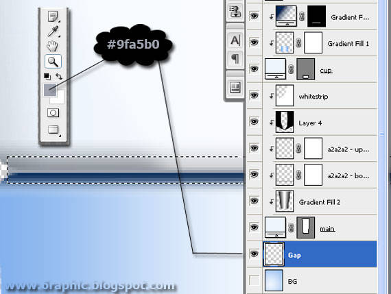
Here I will show you how I put something there to do it. Prepare this first.. Set your Foreground with this #9fa5b0 color. Create a new layer above the Background layer. Create a selection like the image above told you and fill it with that color!

Step 6 - Bottle Sealed
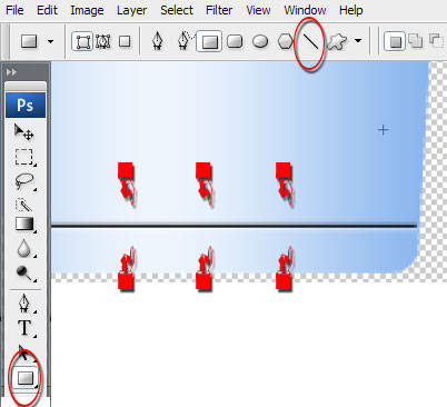
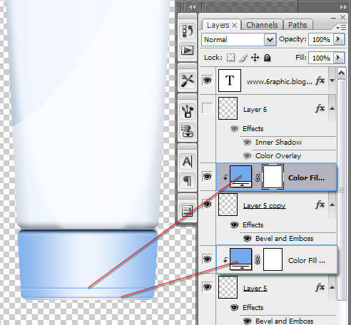
Next to me I do is, adding the Sealed portion of the bottle. First thing first, for this procedure, I'll start by placing two base line in different layer. To do this, press Ctrl + N to create New Layer, Draw a simple line on this layer by pressing the U key on your keyboard. Pick the Line Tool from the menu, Draw it! Just like as shown in Fig.
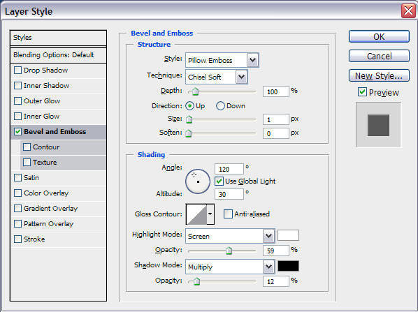
Add the style of this layer by Right-Clicking it than choose Blending > Bevel and Emboss.
Again you'll gonna need the New Fill or Adjustment Layer. To do so.. click its button than to fill the line with a Light Blue (#74a8eb) color like I did. If you're done.. Duplicate the line by Pressing Ctrl + J! Don't forget to copy the layer style as well as the first line. Now you have two line on the Cup of your bottle with two different Light Blue (#74a8eb) color fill adjustment. Do the clipping mask to both of them!

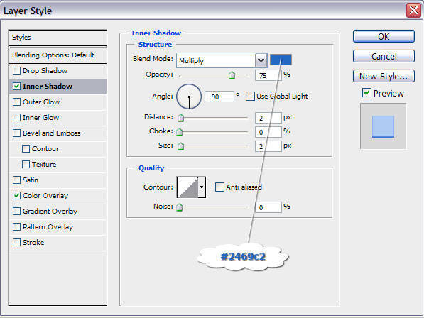
Now I am going to add the recessed area for the cap. Using the Rounded Rectangle (my favo) tool (U) set to your need. I use this set.. Inner Shadow as a Layer Style, Blend Mode : Multiply, color : #2469c2, Opacity : 75%, Angle : -90, Distance : 2px, Choke : 0%, Size : 2px
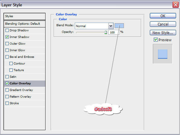
Color Overlay as a Layer Style, Blend Mode : Normal, Color : #adccf3, Opacity : 100%
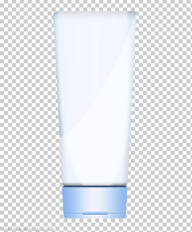
Your product should look like this (or even close.. lol.)
Tired or sumthin'? :( I AM!!!
Complete tutorial : James Pond's 1, James Pond's 2, James Pond's 3, James Pond's 4.


iia ternyata kita kembaran kang :) xixixixixix...
ReplyDeleteemang mantaps kalu gtu kang.. lancar jaya!!!
ReplyDeleteInfonya oke banget. Menambah pengetahuan bagi siapa saja yang ingin mempelajari lebih dalam tentang photoshop
ReplyDeleteAjarin yang buat animasi kartun, genial bisa nggak ngasih tutorialnya?! Pengen nggambar yang kartun2 gitu >.<
ReplyDeleteBerbagi teknik
ReplyDeletemenebar manfaat
salut :)
siippppp
ReplyDeletewaw....
ReplyDeletejiahahahahahaaa............
ReplyDeletejudulnya maknyussssssssss
salam kenal Kang
ReplyDeletetengkyu ya telah berkunjung
semoga bisa menjadi sahabat
salam sukses..
sedj
jadul ritek penting kereaktif,heheeee
ReplyDeleteit's really useful info :) tq 4 share :)
ReplyDeleteThis comment has been removed by the author.
ReplyDeleteHello my friend Genial, thank you very much for your visit, I am writing in English for my visitors to read my postages, happy Friday with peace and happiness. Hugs Valter.
ReplyDelete@ Ajeng Sari Rahayu : sudah ada kuk di sini.. hanya sajja bukan dengan tangan.. (manual*), baru penggunaan tekhnik LineArt nya ajja :)
ReplyDeletemungkin nanti akan saiia terbitkan versi barunya...
@ all : coupla' kudos comin' your way.. :)
Wow! great info.. i just know how photoshop is cool to express our creative idea visually..
ReplyDelete