Tuesday, November 30, 2010

Envelope Icon

Envelope IconHow are you doin' guys? OK. Without any further chit chat or what... I'll explain how to create an envelope using Photoshop.

The size of the envelope here is totally my damn imagination, because if I use the original size of the existing envelope, I am worried about 'producing something that is less than the maximum quality results'.


Step 1

Create a new document in your photoshop. After the new document is ready, let's start by creating a set of folder, give the name envelope.

Create a new layer and name it body or something, it's up to you. Select the Rectangular Marquee Tool (M) and make a selection about the size of your envelope, fill with white.

Right-click the layer thumbnail of your layer body just right on the Layers Palette and add Gradient Overlay layer style as I illustrated in the picture below..


Envelope Icon


Step 2

Create a new layer again, then give the name pattern. Like the previous steps, use the Rectangular Marquee Tool (M) again, create a selection then fill the selection with #E84141 and #3874A7. By seeing to the picture below, you could notice the distance between different color boxes, which are important distances between one another in the same box.


Envelope Icon


Envelope Icon

Go to menu Edit> Transform> Skew and click on the center as shown in the picture so that we can obtain the skew results in question.


Discard the rest of the box (either red or blue on top and bottom sides of the envelope) by removing them. Here I prefer to hide the rest of it by enabling the mask on the layer pattern.


But how come? Read carefully the instructions on the chaotic picture below. (Do not be deceived by the complexity of the drawing lines, hahaha...)


Envelope Icon


Step 3


Create a new layer and name it shade. We'll give a little dimension to the side of the envelope by adding a shadow that will add thickness envelope nuance.

OK.. slow down.. On the layer shade, activate the Gradient Tool (G). Click on the envelope, then pull slightly to the middle. Remove. After the image is formed, set the Opacity to about 35%.


Envelope Icon


Step 4

Turning briefly to Pattern layer. Copy layer pattern and then move to the right side of the envelope. Apply these steps to layer shade, so we will have the right and left complete side with the same pattern and shade, but you have to move it back to the opposite direction.


Envelope Icon


Until this step here, please submit your complaint in the comments box, whenever you get lost...


Step 5

Now we will make a folded paper in the envelope with the requested assistance provided by Photoshop Shape.

OK... straight out, on a new layer (I give the name on it, lower), activate the Shape by pressing the U key on your keyboard, then select the Hexagon as I do.

At this stage, please use a different graphic or perhaps anyone would like to make it manually with the help of Pen Tool (P), please just do it dudes.. hehehehe.. there is no compulsion in religion.. what..??!!


Envelope Icon


Pull your Hexagon size as I make. Ooopss... I believe that I forget something :p... for the color, please select Black to facilitate the selection later or if there are any obstacles on the road.


Envelope Icon


Move Hexagon shape slightly down. Consider the middle point of it, it should end up at the bottom of your envelope.


Envelope Icon


Add Layer styles on your Hexagon layer, Inner Shadow with white color, blend mode is Normal, as I show y'all in the screenshot below.


Envelope Icon


Still on the same layer, add a Gradient Overlay layer style again with sizes as below.


Envelope Icon


Voilaa.. This will be approximately like the picture below if you follow the steps I have applied since the first move.


Envelope Icon


Step 6

Steps to make the folds under the finish .. Means we can apply it to fold the top is not ... easy! But before that I am making a duplicate pattern and shadenya, then my position in the bottom.


Envelope Icon


Now, add a little dimension again on the 'lower' layer by giving us a little shadow.

You (beginners) should be careful in this step. Duplicate Layer 'lower', and create a little bit bigger than the original lower layer by pulling on the upper side slightly beyond the limit, then turn the lower opacity down to 21%.

In this step, please.. you should added Blur to make it more realistic look for the shadow of the paper folds.


Envelope Icon


When you finished this part, then.. go on..!!! Well.. Create the top of the crease. (Please skip this step if you already understand the step 5 in my description above).


Step 7 (Optional)

Create a new layer and name it "upper". Press U on your keyboard, select the Diamond card as I do.


Envelope Icon


Pull your choice (Diamond Card) exactly the same as we did in the fifth step above, only this time, position the Diamond Card at the top of the envelope.

Add Inner Shadow with a set of white, Blend Mode Normal, Opacity 100%, Angle direction -90, and Distance 25 px.


Envelope Icon


Do not go anywhere, because we still have to add a Gradient Overlay like the picture below.


Envelope Icon


Before you sip your coffee, you should add the final step of our learning.. this time, you will add that part with a shadow, like a shadow on the bottom fold of the paper earlier.

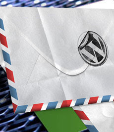
Voila my final Envelope Icon results..


Envelope Icon


...And with a little magic here and there... finaly I got this.. :) Use your wild imagination doods!


Envelope Icon


Hire Me?!


Envelope Icon


Envelope Icon


Saturday, November 27, 2010

Hot Smoking Babe

Hot Smoking BabeIn our tutorial this time, I will try to combine several images to get a new form of image with this certainly easiest way of many ways that can be taken.

Therefore, it helps alot if you're mastering first few tricks that I wrote earlier which ain't include here due to the lessons I have ever been poured on the previous tutorials (that's if you are a good listener anyway, lmao).

Step 1

The first step after you enter your photo to edit is remove the parts that you don't want. Piece o'cake!!!


Hot Smoking Babe

As you can see, here I ain't a good Marlboro cigarette's affiliate or somethin', so.. I will delete the following cigarette from my picture that will automatically require additional sleeve missing, instead. Hahaha.. removing some of the images is already a thing, adding, or even patch the missing pieces is another thing, of course.

Hot Smoking Babe

The tutorial section about how you can remove or add something to something is obviously on my previous tutorials on the subject concerned. Spend your time in this first if you have not mastered on that part.

Hot Smoking Babe


OK. Once we remove the unnecessary part of your image, than the image we had of course will be slightly reduced. So.. I add a dimension on it and add a Black background. Why Black? Because black is the the most powerfull color you can use and most secure when it comes to photo editing, lol. Trust me!

No need to be that perfect at that point, as most of it will of be covered by the end anyways.

Step 2

Next, I brought to y'all this lovely model. Don't be affected with its appearance, lmao. Appearances can be deceiving.

Hot Smoking Babe


As usual, crop your model from the background. I see if I flip her in the opposite direction, it looks like it would be more make sense, because the feet of these models are correct in that position. I'm back. Then I set it to more contact with the hand.

Hot Smoking Babe


Desaturate model by pressing Ctrl + Shift + U on your keyboard and change the Blending Mode to Screen.

Hot Smoking Babe


Masjid KitaStep 3

The basic composition is already on your hand, now it is the time to get some action! With the help of Liquify tool, I polish in such a way on the sides of our model to resemble the effects of smoke. To short this tool cut, you can press Shift + Ctrl + X on your keyboard.

No need to fear! Don't be so perfect, you're still human, aren't ya?!?! Lol... I still have much to learn it my self, lmao. After it feels pretty good on my eyes, I draw conclusions, it would make more sense if our model in the hands away from the smoker.

Hot Smoking Babe

Step 4

Because our model here has been shaped in such a way, why do not we just add the smoke all real? what's more smokin' than smoke, lmao?

With the help of gallery that I have (please do some googling thing for this), I present the real smoke to increase the reality of our model to be smoky later.

Hot Smoking Babe

I purposely selected the image source with a black background, as I've said in the beginning, that the black is a safe fantastic color design you can get, hahaha.. then the two extra images that I collated over the layer model, and then to your living fox Blending Mode to Screen or Lighten.

Step 5

Now we're getting somewhere! To give it an extra pop, I added some detail on the model.. Create a new layer, name it Pop. Pop on the layer, I scraped my Brush (white color) on the side of our model, then I set the pop layer into Overlay.

Hot Smoking Babe

Hot Smoking Babe


Step 6 (Optional but worthy)


As a final touch, I filled the entire image with a solid blue color, then set this layer to Overlay with the opacity at about 25%. Well ... I do not know, this is not a necessary step to add, but it brings a little extra mood and makes the whole image together harmoniously.

Hot Smoking Babe

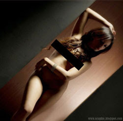
There you have it. You've created the Hot Smoking Babe of your dreams.


Hire Me?!

Thursday, November 25, 2010

Muhammad Sholeh vs Cippes

Muhammad Sholeh vs CippesHowdy... :) May I introduce you, a friend o'mine who gave me this crazy idea. I decided to post it here. Known as a resto named Cippes, located at Jababeka area. Muhammad Sholeh, as the graphic designer of this 3D stuff, allowed me to put the artwork after I repaint it with my favo photoshop.

I think that was a creative process that gets you using your crazy brain. Imagine this! The workflow for creating it involves taking no photographs at all. The author just do some capturing the amazing moment only with his eyes and his brain. 3D images without the need for 3D software.

Let's take a look first at the image he's creating.

Muhammad Sholeh vs Cippes


Good job, your work is done Cing! And for y'all guys.. Write down anything you like to your creative advertisement design. Use your software well, but also use and explore your crazy innovative brain.

Muhammad Sholeh vs Cippes


See you at the next tutorial.

Hire Me?!


Saturday, November 20, 2010

Guitar D Drop Tuning

Guitar D Drop TuningDrop D tuning (commonly known as 'dropped d') is very very very simple to get. Usually we can easily find this kinda trick when you hear about heavy metal stuffs.. I prefer to call it the industrial rock, rock music today.

WHATEVER.. Lol..!!!

Now a days.. I really like so much about that kinda music... bands like Godsmack, Mudvayne, American Head Charge, and so on because they use a tuning like this one. By lowering the E tone makes the music a bit more weight, the result.. more frightening.. pounding drums would have more make our heart beat faster when we're in the studio or something.

I'M IN CHARGE MISTER!!! Lmao!!!


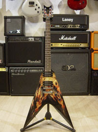
It's easy ... All you have to do is lower the tone E (6th string) to D. Anticipation of its similarity to pluck the strings 4th (D string) and then pick the low E that you have sent down earlier. See what I've done below...


Guitar D Drop Tuning

You guys don't need some hard move to your guitar power chords to get sound in tune, once you get that just like I said, it RULES!!!


Hire Me?!