 In our tutorial this time, I will try to combine several images to get a new form of image with this certainly easiest way of many ways that can be taken.
Therefore, it helps alot if you're mastering first few tricks that I wrote earlier which ain't include here due to the lessons I have ever been poured on the previous tutorials (that's if you are a good listener anyway, lmao).
Step 1
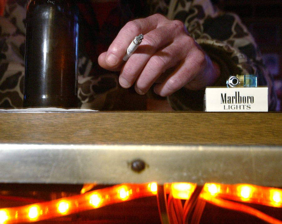
The first step after you enter your photo to edit is remove the parts that you don't want. Piece o'cake!!!
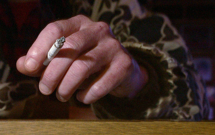
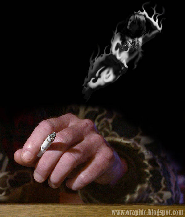
As you can see, here I ain't a good Marlboro cigarette's affiliate or somethin', so.. I will delete the following cigarette from my picture that will automatically require additional sleeve missing, instead. Hahaha.. removing some of the images is already a thing, adding, or even patch the missing pieces is another thing, of course.
The tutorial section about how you can remove or add something to something is obviously on my previous tutorials on the subject concerned. Spend your time in this first if you have not mastered on that part.
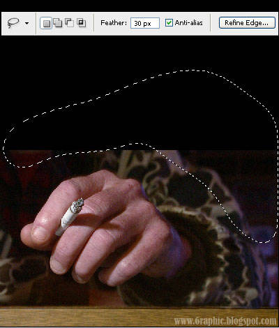
OK. Once we remove the unnecessary part of your image, than the image we had of course will be slightly reduced. So.. I add a dimension on it and add a Black background. Why Black? Because black is the the most powerfull color you can use and most secure when it comes to photo editing, lol. Trust me!
No need to be that perfect at that point, as most of it will of be covered by the end anyways.
Step 2
Next, I brought to y'all this lovely model. Don't be affected with its appearance, lmao. Appearances can be deceiving.
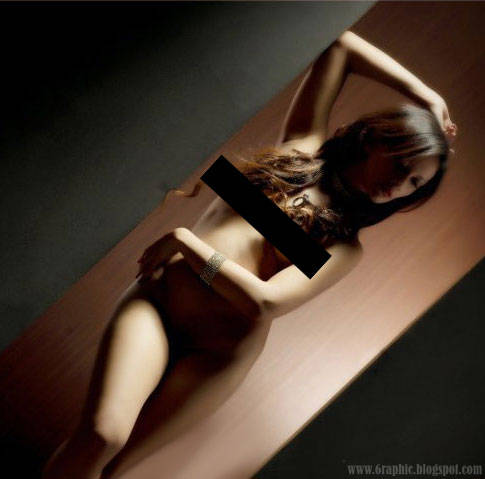
As usual, crop your model from the background. I see if I flip her in the opposite direction, it looks like it would be more make sense, because the feet of these models are correct in that position. I'm back. Then I set it to more contact with the hand.
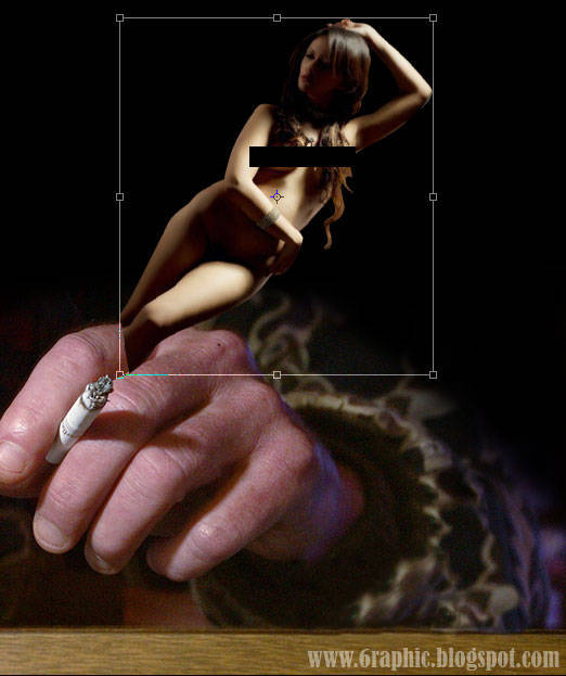
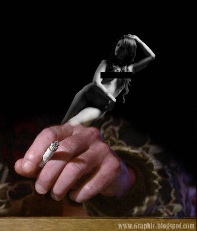
Desaturate model by pressing Ctrl + Shift + U on your keyboard and change the Blending Mode to Screen.
 Step 3
The basic composition is already on your hand, now it is the time to get some action! With the help of Liquify tool, I polish in such a way on the sides of our model to resemble the effects of smoke. To short this tool cut, you can press Shift + Ctrl + X on your keyboard.
No need to fear! Don't be so perfect, you're still human, aren't ya?!?! Lol... I still have much to learn it my self, lmao. After it feels pretty good on my eyes, I draw conclusions, it would make more sense if our model in the hands away from the smoker.
Step 4
Because our model here has been shaped in such a way, why do not we just add the smoke all real? what's more smokin' than smoke, lmao?
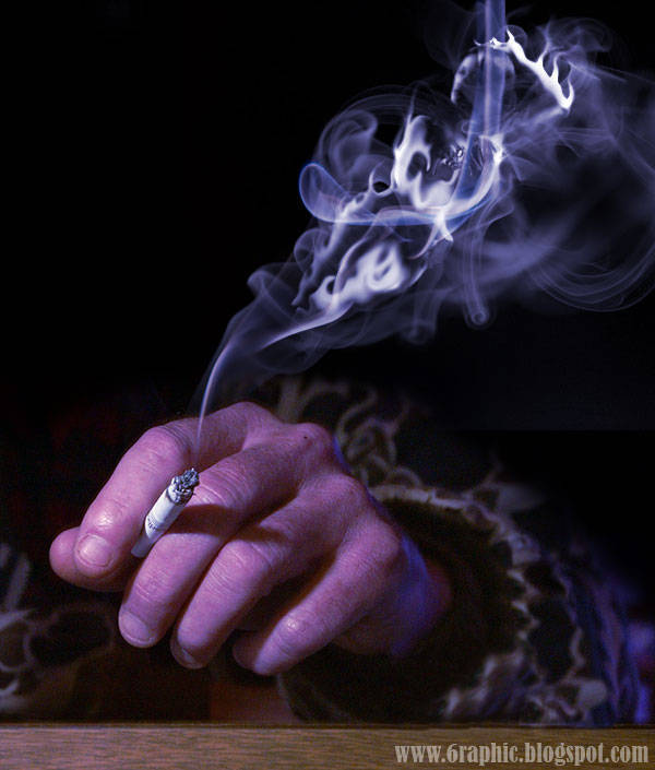
With the help of gallery that I have (please do some googling thing for this), I present the real smoke to increase the reality of our model to be smoky later.
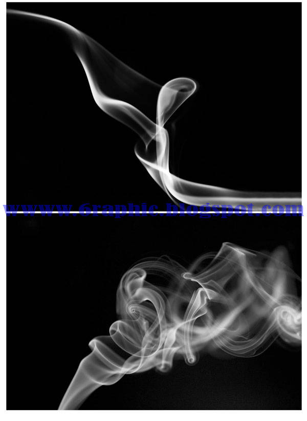
I purposely selected the image source with a black background, as I've said in the beginning, that the black is a safe fantastic color design you can get, hahaha.. then the two extra images that I collated over the layer model, and then to your living fox Blending Mode to Screen or Lighten.
Step 5
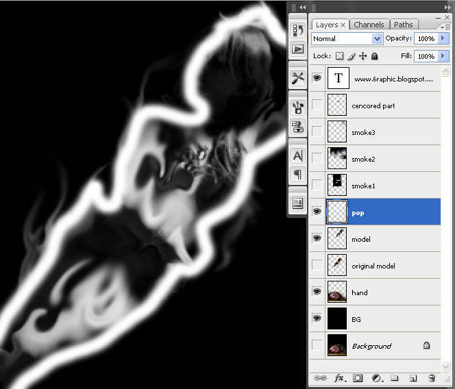
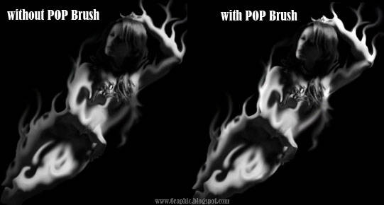
Now we're getting somewhere! To give it an extra pop, I added some detail on the model.. Create a new layer, name it Pop. Pop on the layer, I scraped my Brush (white color) on the side of our model, then I set the pop layer into Overlay.
Step 6 (Optional but worthy)
As a final touch, I filled the entire image with a solid blue color, then set this layer to Overlay with the opacity at about 25%. Well ... I do not know, this is not a necessary step to add, but it brings a little extra mood and makes the whole image together harmoniously.
There you have it. You've created the Hot Smoking Babe of your dreams.




cool idea Mas Gen
ReplyDeletethanks for share
:)
wooow... Keren boss
ReplyDeletejadi pengen nyoba sendiri :))
Mantaf kawan,,, mat pagi hadir dg senyum awal mngu....
ReplyDeletewuich,keren banget nich.....
ReplyDeletei like it...
pic bagus, cumannn......( malu ), agak tak tau bahasa...hahahhahahahaa...kliatan bhs inggris waktu sekolah payah niainya.....kwkwkwkw
ReplyDeletesedikit porn juga yach sob,,, tapi keren banget desainnya,,,,
ReplyDeletetop markotop!
ReplyDeleteWow mantap hehe
ReplyDeletewah keren kk :)
ReplyDeleteq coba deh
mak nyus desainnya kak :D
ReplyDeletewaw..
ReplyDeletegood idea bro..
il like it !
wah, bagus banget hasil editannya sob. haha.. saya masih harus banyak belajar kayaknya untuk dapat hasil begini..
ReplyDeletewiiihhh gebleg keren!!
ReplyDeletekereen bin mangtab tenan..
ReplyDeletesekolah dimana to he he
Because black is the the most powerfull color,
benul.. alangkah hebatnya si kolor ireng :D
bagus,,,
ReplyDeletekreatif,,,
keren bro, artistik. oh..ya.. linknya udah saya pasang,boleh intip.
ReplyDeletessssmmmokkeeeen gan
ReplyDeletesalam sobat
ReplyDeletewoo,hot smoking babe.
memang sip.
@ all : thanks for all incoming massages guys :)
ReplyDeletecreativity always produces beautiful, lovely, lovely enjoyed, too beautiful to use.
ReplyDeleteyep.. too beautiful to use :(
ReplyDeletenice tips... :D
ReplyDeletethats very cool sotoshop bro.
ReplyDeletei want to try it now.
wish me luck.
Gila mantap banget tuh,
ReplyDelete:D :D
keren mas :) tapi lebih keren kalo yang item2 persegi panjang nya diilangi ;) hiks
ReplyDeletetetap berkreasi yo :) !
ntar kena pasal saiia nya kang?!?!?
ReplyDelete